A website will look more professional if you pay close attention to the appearance of the text, make the links behave consistently, and ensure that photos are not so large that they distort the design of your pages.
General Tips to Help your Website Pages Look and Behave Better
- Use only one space after end of sentence punctuation, which reduces rivers of white space in text.
- We recommend opening in a new window any links that go off your site. If you are linking to another page on your own site, open links in the same window. Exception: Open large images in a new window.
- Be sure that images aren't so large that they make the page stretch wider. You can do a quick test on the page by putting your finger on the right edge of another page that doesn't get updated often (such as the Contact page). Then click on the page that you edited and note whether the edge jumps past your finger. If it does, chances are that your photos are too large.
- Be sure to set the default text, page, and title styles by going to Design > Text/Font Advanced (CSS) settings.
- Follow the typography tips described under "More Tips for Creating Great-Looking Text" to ensure that you use the styles consistently.
- Avoid copy/paste from Word or email programs, which can put a large number of HTML codes into the text and create an inconsistent appearance or a bloated page.
- If you do copy/paste from these sources, use the Paste as Plain Text option (a clipboard with the letter T on it) or the Paste from Word option (a clipboard with the letter W on it) when you paste.
- Also be sure to select the copied text and use the "Remove Format" Eraser tool in the editing toolbar (click for example in new window) if you copy/paste material from other sources.
- Avoid using non-breaking spaces ( ) in the HTML code unless you need them to keep text together on a line. They can make the text line breaks look weird.
- To remove non-breaking spaces, open the text in the website editor, click the Source button, copy/paste everything into a text editor such as Notepad. Then, replace all codes with a single space. Also replace any double-spaces with a single space. Then copy/paste everything back into the Source text area of the website editor. Click the Source button again to review the changes, then click Apply Changes.
More Tips for Creating Great-Looking Text

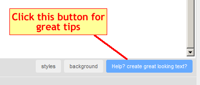
The Sitebuilder Editor offers some excellent tips for making your pages look better. To see those tips, edit your text and then click the blue button, which looks like the example shown at right. A new window opens with the tips (click for example in new window). These tips are summarized just below:
DO:
- keep it simple
- use default settings
- create short paragraphs (white space helps readers!)
- use page and title styles
- use different title fonts
- verify your spelling
- use bold titles above paragraphs
- focus on content
- use proper spelling, grammar, and punctuation
- take your time
- keep it simple
DON'T:
- overuse FONT setting
- overuse SIZE setting
- overuse COLOR settings
- make long paragraphs


